
Designing certificates for kids: playful, not childish
Bright colours and big stars without talking down: how to design awards children are proud to take home, and that parents are happy to put on the fridge.

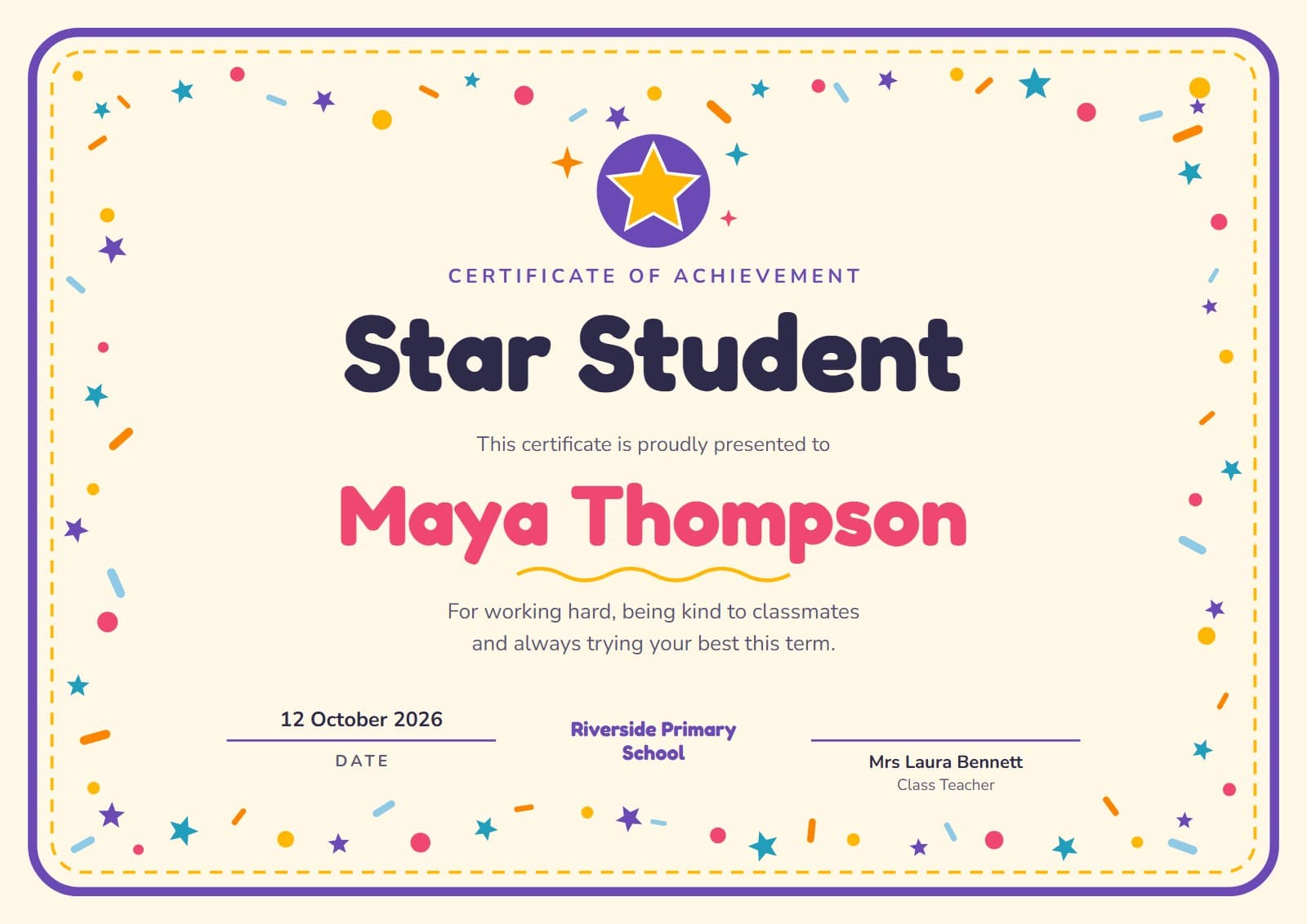
Children take certificates seriously. A star-of-the-week award can be the thing they talk about all the way home, and the thing that is still stuck to the fridge months later. That is a good reason to design them with as much care as any award for adults: playful enough to delight, but never so babyish that a ten-year-old is embarrassed to carry it out of the classroom.
1. Design for the child who will read it
Young readers need large, clear letters. Choose a rounded, friendly typeface for the title and a simple, highly legible one for everything else, and avoid tight scripts and all-capital paragraphs. Keep the words short. If a child can read their own certificate aloud without help, it means more to them.
Make their name the biggest thing on the page after the award title. It is the part they will point at.
2. Colour and decoration with a purpose
Bright colours work, but pick a palette rather than every colour in the box: two or three main colours and one accent. Decoration such as stars, confetti and badges belongs around the edges, framing the name rather than competing with it. Leave the middle calm.
Older children notice when something looks like it was made for much younger ones. For upper primary and early secondary, keep the energy but trade cartoon characters for bolder shapes, cleaner type and colours they might choose themselves.
3. Praise what they did, not who they are
The line under the name is where a children’s certificate can do real good. Praise that names an effort or a choice, like practising, helping, trying again, tells a child what to keep doing. Praise for being “clever” or “the best” is pleasant for a day and says nothing about how to earn it again.
4. Keep it fair across the class
Children compare certificates. Keep a simple record of who has received what during the year, so every child is recognised for something real and the same few names don’t keep coming up. Using one design per award, such as reading, kindness or effort, helps children and parents see the range of things that count.
5. Protect their privacy
A certificate that leaves the classroom can end up anywhere, so put on it only what the moment needs: first name and surname, the award, the date and the school. Leave off dates of birth, home addresses and anything else you wouldn’t want shared beyond the family.
6. Make the handover a moment
A certificate handed over in assembly, with the reason read out, is worth far more than one found in a book bag. Print on card so it survives the journey home, and hand it over flat. For a whole class or a whole school, issue them from one spreadsheet so every name is spelled right; see our guide to bulk certificates from Excel.
“If a child can read their certificate aloud by themselves, it means twice as much.”
The Certale team
Certale, by PPT-Design LtdWe design Certale’s 1,000+ certificate templates and build the app that issues and verifies them. In the Journal we share what we have learned about recognising people well: the wording, the design and the practical side of getting certificates into the right hands.