What makes a certificate look official
Seals, signatures, spacing and a way to check it’s real: the small details that make paper feel trustworthy, and why the most official-looking certificates are also the most honest ones.


People decide whether a certificate looks official in a second or two, long before they read it. They are not checking for gold foil. They are checking, mostly without noticing, whether it follows the conventions they have seen on certificates they already trust. Get those conventions right and even a simple design reads as genuine.
1. A clear order of information
Official documents answer the same questions in the same order: who is issuing this, what is it, who is it for, why, when, and who vouches for it. A certificate that follows that order feels familiar; one that scatters the information feels improvised.
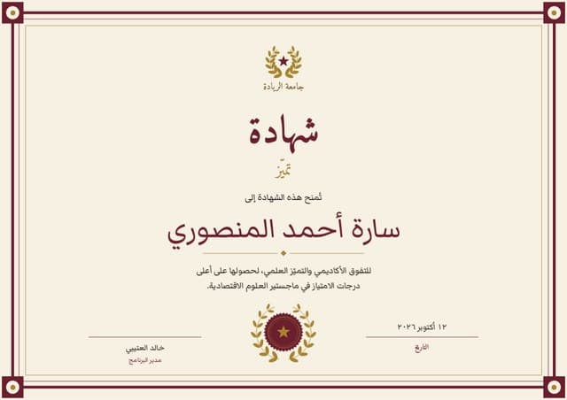
- Issuer, at the top: the organisation’s name and logo
- Title: Certificate of Completion, Award for Excellence
- Recipient: the largest text on the page after the title
- Statement: one or two lines on what was achieved
- Date and, where relevant, place
- Signatures with printed names and roles
- Certificate number and a way to verify it
2. Name the issuer properly
Use the organisation’s full name as it appears on its own letterhead, not an abbreviation people outside might not recognise. Use a sharp, high-resolution logo (a vector file if you have one) rather than a blurry copy from a website. For training providers and professional bodies, add the details a reader might want to check, such as a registration or membership number, but only ones that are real and current.
3. Signatures that mean something
A signature is a person putting their name to a claim, so make it clear who that person is. Print their name and role under each signature line. Two signatures, for example a course tutor and a head of department, are a common convention for awards and qualifications.
If you use a scanned signature, scan it in dark ink at high resolution on a white background, so it prints cleanly rather than as a grey smudge. And only use a signature with that person’s permission, for certificates they have actually approved.
4. Seals and emblems: use your own
A seal or emblem does a lot of work: it frames the signatures and signals that the document was finished with care. Use your own crest, your logo inside a simple roundel, or a design element from the certificate itself. Foil seal stickers are an inexpensive way to add a real-world finishing touch to printed copies.
5. Spacing, borders and type
Generous margins are the cheapest way to look expensive. Leave clear space around the edges and between blocks of text, and let a border frame the page rather than crowd it. Pick one typeface for the title and name, often a serif or script with some character, and one plain typeface for everything else. Centre-aligned layouts read as traditional; left-aligned ones as modern. Either can look official if the alignment is consistent.
Check the longest name on your list before you print. A name that is squeezed into a smaller size than everyone else’s, or that crashes into a border, is the fastest way to make a certificate look homemade.
6. Dates nobody can misread
Write dates out in full: “12 October 2026” rather than 12/10/2026, which a reader in the United States would take for the 10th of December. If the certificate expires, for a safety course or a first-aid qualification for example, show the expiry date as clearly as the issue date.
7. A number, and a way to check it
The strongest signal of all is that the certificate can be checked. A unique certificate number, plus a QR code or short link that opens a record held by the issuer, lets an employer or admissions team confirm it in seconds instead of sending an email and waiting.
Every Certale certificate gets both: a code printed under its QR code and a story page that shows who issued it, to whom and when, and whether it is still valid. Anyone can check one at certale.com/verify, free and without an account. We explain the checks behind it in how certificate QR verification works.
“The most official thing a certificate can do is invite people to check it.”
8. Print like it matters
A heavier matte card feels more permanent than standard copier paper and takes ink without shine. Print a test page first and check the colours, because screens are brighter than paper. Make sure nothing important sits too close to the edge, where some printers can’t reach. Hand it over flat, in a folder or envelope, not folded.
Official-looking certificate checklist
The Certale team
Certale, by PPT-Design LtdWe design Certale’s 1,000+ certificate templates and build the app that issues and verifies them. In the Journal we share what we have learned about recognising people well: the wording, the design and the practical side of getting certificates into the right hands.